ShopDreamUp AI ArtDreamUp

Deviation Actions


Suggested Deviants


Suggested Collections


You Might Like…


Featured in Groups


Description
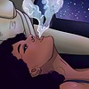
So, this is the piece I've been working on the past few days.
I realized that I enjoy drawing realistically a lot, so expect even more of these drawings in the future.
This one was basically an exercise to improve highlighting and shading. I really suggest you try out something like this too! You'll learn a lot from it.
Materials used: Toned grey pastel paper, a blending stump, a white and a black pastel pencil and an eraser.
❤️Prints available ❤️
❤️Constructive criticism is always appreciated!❤️
💬Any suggestion whom to draw next? I'd like to draw another character from Game of Thrones but I'm open for other suggestions too!
Image size
3046x4062px 6.64 MB
Make
Xiaomi
Model
Redmi Note 4
Date Taken
Apr 20, 2018, 5:16:07 PM
© 2018 - 2024 ArtOfRemedy
Comments22
Join the community to add your comment. Already a deviant? Log In
ProjectComment There is something fantastic about this piece! Ooh, if you're doing more GoT, I'd love to see Tyrion! I do see a wide range of tones here, and you're not afraid to put light and dark side by side in her hair particularly, which makes it feel very real in its texture - as well as the very cool, fun wispy strands. You could push some of the whites and darks more, but not every piece has to capture every possible value. For a black and white piece starting from a midtone I think it looks really nice. Honestly profile is one of the toughest angles to draw, since so much of it looks different than what you'd expect. You totally nailed the eyes, especially those really beautiful highlights - I think they're much improved since your WonderWoman drawing, and that you got an overall softer and more realistic look to your shading.
I went ahead and googled Daenerys in profile for comparison so I could talk a little about how you might improve it (I started this back before you linked your reference, so I hope it's still helpful).
The differences I see are mainly a question of angles and concave/convex. I went ahead and drew straight on my reference image in different colors so you could see what I'm talking about. Obviously, it's not your reference, but it seems pretty similar, so hopefully it helps! You may be able to not change some of these things and still have a picture that looks great, but here are the main things I noticed:
:origin()/pre00/1e97/th/pre/f/2018/120/4/3/screen_shot_2018_04_30_at_11_01_25_am_by_beautifulescapsim-dca9fku.png)
Teal (under her chin) It should angle up more as it goes towards her neck.
Red (mouth) the lines actually curve inwards as they goes towards the corner of her mouth.
Yellow (shadow at corner of mouth) yours is almost a perfectly straight line, but I do see a slight curve to it here.
Green (highlight at corner of mouth) yours curves towards the mouth, but the one in my reference image curves away from the mouth.
Blue (nose bridge to tip) yours curves outwards to catch the tip, but the line in my reference is almost perfectly straight.
Overall, the thing I think I like the most is your cropping decisions. The negative space to the right and the fact that we don't see her whole head gives it a feeling of closeness. It feels really personal. I can't wait to see what you do next!
I went ahead and googled Daenerys in profile for comparison so I could talk a little about how you might improve it (I started this back before you linked your reference, so I hope it's still helpful).
The differences I see are mainly a question of angles and concave/convex. I went ahead and drew straight on my reference image in different colors so you could see what I'm talking about. Obviously, it's not your reference, but it seems pretty similar, so hopefully it helps! You may be able to not change some of these things and still have a picture that looks great, but here are the main things I noticed:
Teal (under her chin) It should angle up more as it goes towards her neck.
Red (mouth) the lines actually curve inwards as they goes towards the corner of her mouth.
Yellow (shadow at corner of mouth) yours is almost a perfectly straight line, but I do see a slight curve to it here.
Green (highlight at corner of mouth) yours curves towards the mouth, but the one in my reference image curves away from the mouth.
Blue (nose bridge to tip) yours curves outwards to catch the tip, but the line in my reference is almost perfectly straight.
Overall, the thing I think I like the most is your cropping decisions. The negative space to the right and the fact that we don't see her whole head gives it a feeling of closeness. It feels really personal. I can't wait to see what you do next!